Rotem Egozy
Amplio “Feedback”
My Role
UI, UX
Year
2023
Tools
Figma
Background
Amplio is a learning platform for special education that integrates a learning management system with structured programs and curricula for dyslexia, designed for educators, students, and administrators. When I joined Amplio as a team member, the company was preparing for a funding round and was therefore focused on improving, operating, and enhancing the platform's user experience. I joined the team alongside a UX designer and a product manager, and we worked together throughout the project in a high-quality collaborative effort.
Educator caseload project overview
The goal of the project was to create an intuitive and personalized feedback experience that presents feedback clearly and effectively, transforming it into a tool that actively promotes student learning and progress. Throughout the project, we developed visual elements incorporating symbols and characters that convey feedback in an accurate and empathetic manner, while maintaining pedagogical flow and educational context. The solution was designed in multiple phases, with each phase focusing on enhancing communication between teachers and students to ensure that feedback not only guides towards the desired outcomes but also strengthens students' understanding and confidence.

Design Process
Phase 1 -
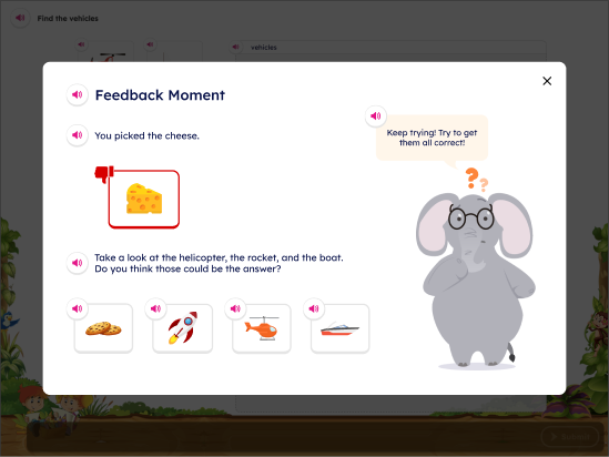
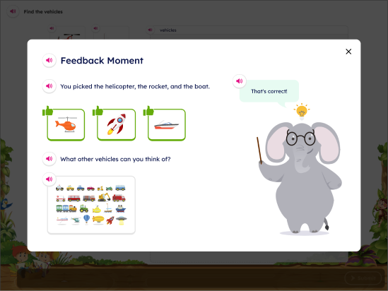
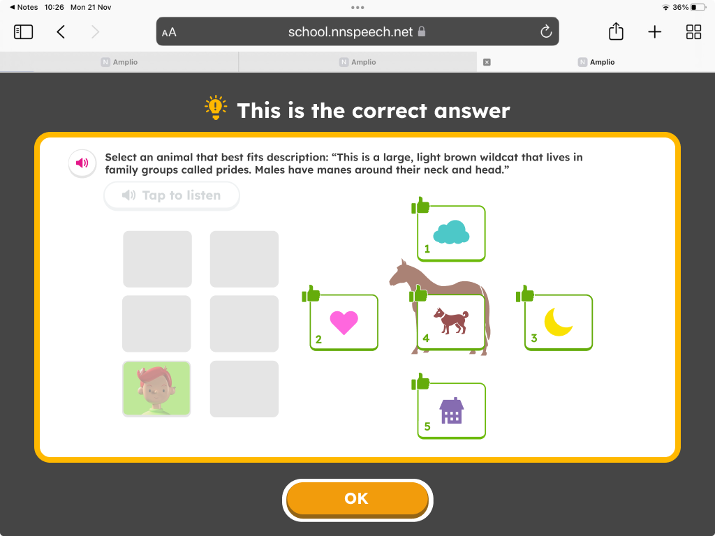
The Phase 1 feedback retains the success/error indicators and correct answer display from the current system, while introducing a new "general feedback template" that includes additional visual elements, such as a confused character, to convey more nuanced responses.
Phase 2 -
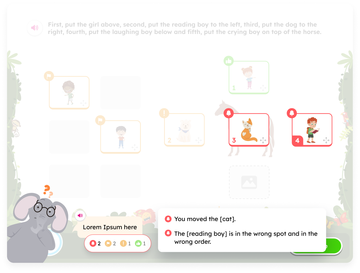
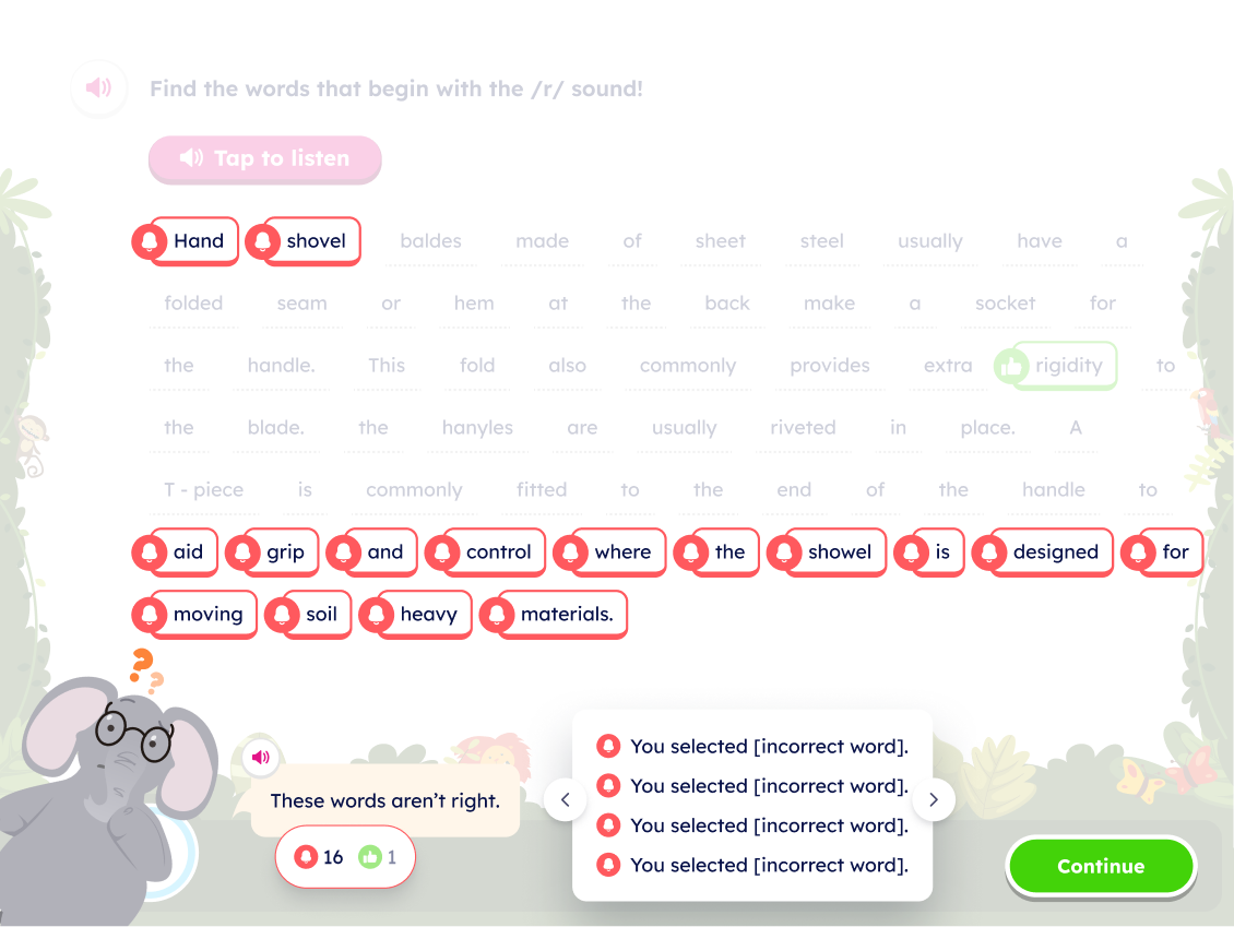
The Phase 2 feedback improves upon the success/error indicators error display by using distinct visuals for different error types.
Also, students will be able to see that they have made different types of errors on exercises (i.e., an incorrectly chosen distractor versus a missed target). We selected a friendly elephant as the companion character that would present the feedback to the student.
Pain Points:
- Discouragement and boredom: The students have learning disabilities and social difficulties, and some of them are even non-verbal. During the learning process, receiving negative feedback often results in a negative experience for the student and, in some cases, is delivered in an insensitive manner.
- Unclear error reasons and very generic feedback: Students struggle to understand their mistakes when all incorrect answers are presented without distinct indicators, making it hard to identify the reasons for their errors.The feedback is very confusing and superficial, and does not accommodate complex scenarios like drag and drop. For example, a different visualization for an unmoved target versus a moved distractor in drag/drop.
- Development challenge: The system is built as a popup on a popup and supports multiple types and sizes of screens. This means that incorporating the feedback into the flow creates a third popup. Initially, the elephant character was designed to cover the entire screen, intended to add a light-hearted touch to the feedback framework. However, it was challenging to adjust it so that it wouldn’t obscure the actual exercise, especially when there was lengthy feedback or different kind of exercise template.
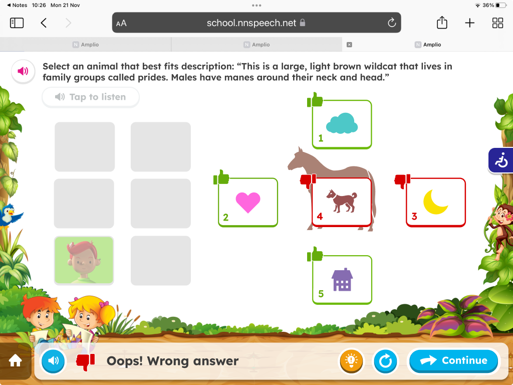
Old Screen
At the beginning of this project, there was a meeting with the PM, Design Lead and myself. In this meeting, the project was introduced to me, including the goals and and the need of splitting this project into few phases.
Sketch of Main Page
Sketch of Assignment View - Single Student
Understanding these challenges and pain points, it led us design the following solutions:
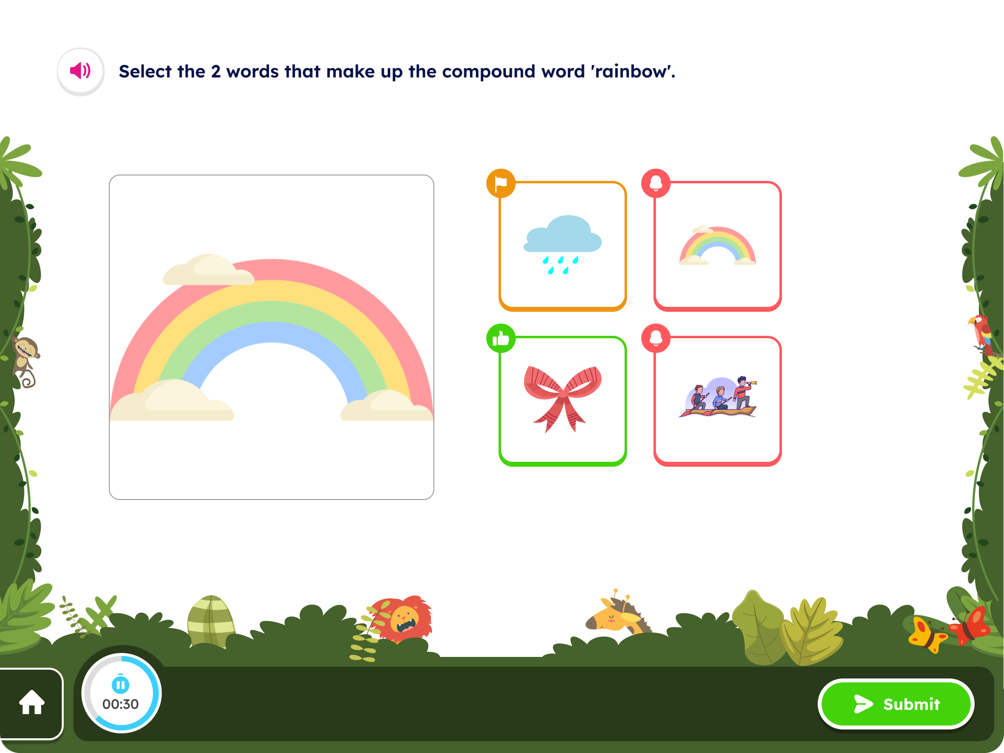
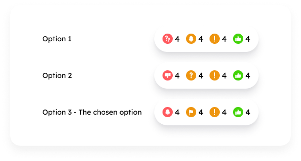
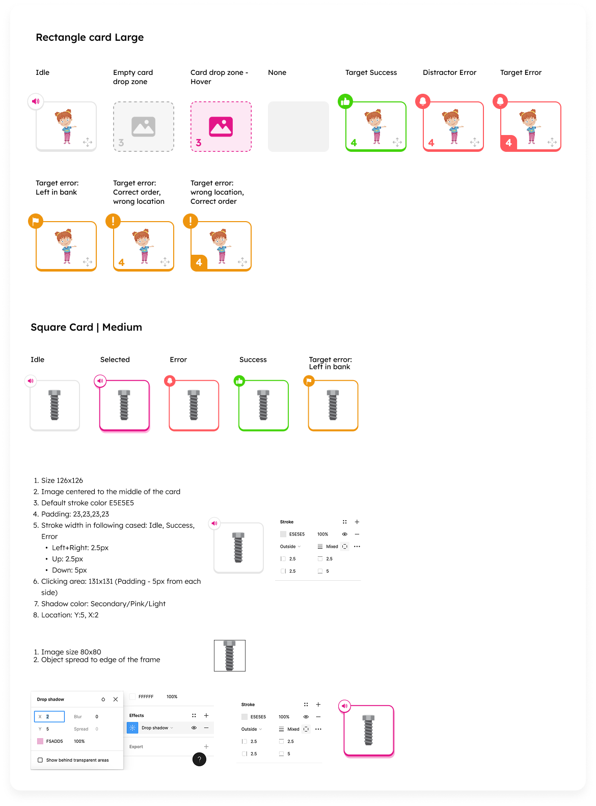
- I created a set of icons that do not convey a harsh sense of failure and expanded the color palette to ensure that red was not the only color used to represent failure. Additionally, we designed illustrated frames together with Amplio’s illustrator and adjusted them to reduce the cognitive load on the student.
- To enhance the user experience, I created a flexible and clear feedback template that allows for the presentation of feedback in a more precise and tailored manner across various scenarios. In the first phase, I focused on aligning the UI in terms of component sizes, colors, shadows, and more. I created a layout of all the required elements and components and unified them visually as needed.In the second phase the template I created distinguishes between four types of feedback: error, two categories of warning, and success, enabling effective communication with nuanced messages that always end on a positive note. Additionally, the template supports more complex situations, such as providing multiple feedback responses simultaneously, displaying lengthy feedback, and accommodating pagination.
- The elephant now peeks in from the side, allowing space for the triad of feedback (success, error, warning), and there is no darkening of the popup; instead, it features a sort of mask so that the game remains subtly visible in the background. Additionally, I redesigned the timer at the bottom of the screen with the following objectives: a. To provide the student with a cue for how much time remains until the end of the exercise. b. To allow the student to pause and restart the timer for that exercise, encouraging them to reduce errors if they need to step away for a moment to attend to something else. This aligns with the idea of assessing and evaluating students fairly.
Understanding these challenges and pain points led me to the following solutions:
- The cognitive load is resolved through the table organization of groups and students.
- Adding flexibility through adaptability in queue organization and states of exercises.
- Meeting curriculum objectives is reflected in the recording and the assessed quality of the recording, which allows for providing accurate grades that support the curriculum.
Example of organization screen filtered by Groups and Students
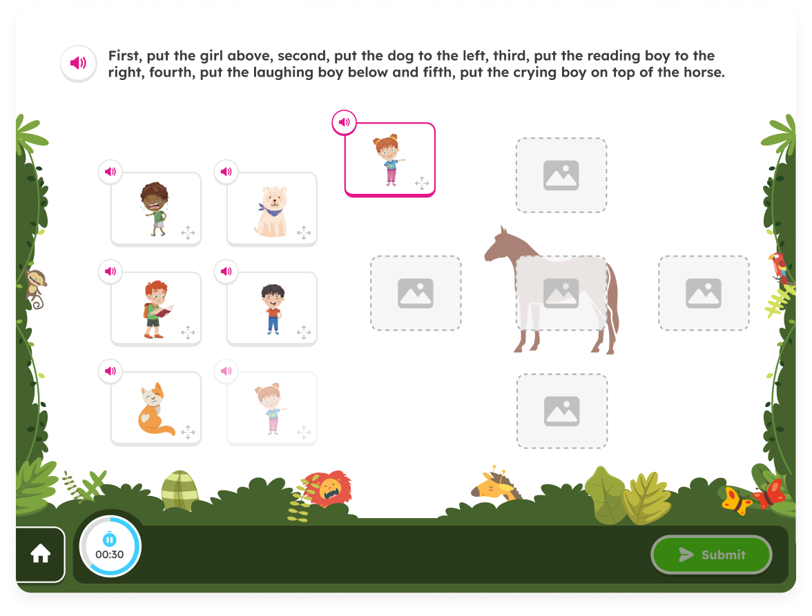
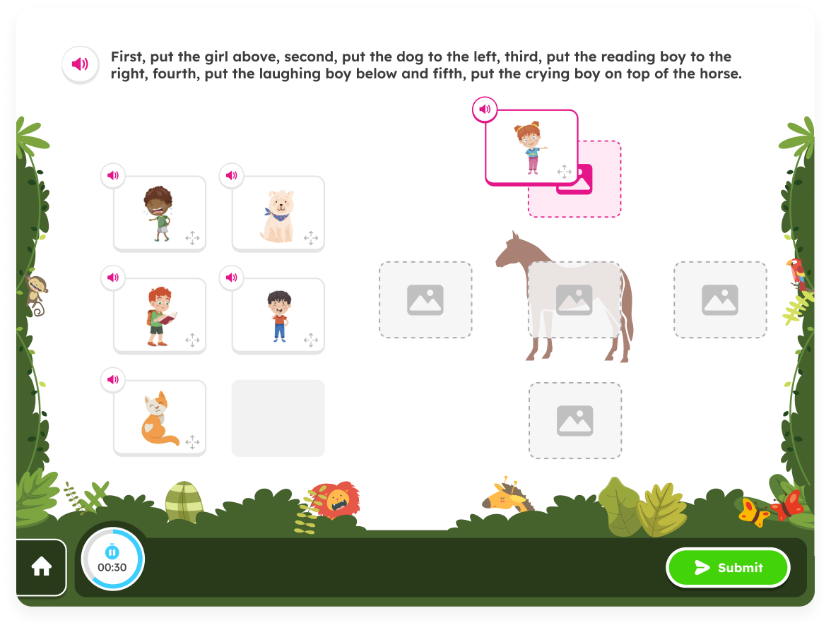
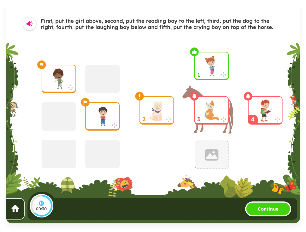
Sketch of incorrect answer
In retrospect
During my time as a product designer at Amplio, I encountered exciting challenges in the field of user experience design. I raised issues related to UX that needed to be rethought and redefined. This was a crucial point in the project, as there were areas in the system that didn’t function properly from the start and required solutions. I also needed to think through and solve edge cases for various scenarios, from empty states to UI solutions that were not yet part of the design system. One of the main aspects of the role was creating design solutions that supported both the company’s goals and the users' needs while maintaining an intuitive and personalized user experience. Close collaboration with the development, marketing, and product teams allowed me to deeply understand customer needs and business objectives, leading to effective design solutions.
Working at Amplio sharpened my skills in balancing aesthetic appeal with high functionality and provided valuable insights into large-scale digital product design processes.
I'm looking for my next experience,
please feel free to contact me
rotemegozy@gmail.com // Tel: 054.7694270
Rotem Egozy
About & Contact
Amplio “Feedback”

My Role
UI, UX
Year
2023
Tools
Figma
Background
Amplio is a learning platform for special education that integrates a learning management system with structured programs and curricula for dyslexia, designed for educators, students, and administrators. When I joined Amplio as a team member, the company was preparing for a funding round and was therefore focused on improving, operating, and enhancing the platform's user experience. I joined the team alongside a UX designer and a product manager, and we worked together throughout the project in a high-quality collaborative effort.
Educator caseload project overview
The goal of the project was to create an intuitive and personalized feedback experience that presents feedback clearly and effectively, transforming it into a tool that actively promotes student learning and progress. Throughout the project, we developed visual elements incorporating symbols and characters that convey feedback in an accurate and empathetic manner, while maintaining pedagogical flow and educational context. The solution was designed in multiple phases, with each phase focusing on enhancing communication between teachers and students to ensure that feedback not only guides towards the desired outcomes but also strengthens students' understanding and confidence.

Design Process
Phase 1 -
The Phase 1 feedback retains the success/error indicators and correct answer display from the current system, while introducing a new "general feedback template" that includes additional visual elements, such as a confused character, to convey more nuanced responses.
Phase 2 -
The Phase 2 feedback improves upon the success/error indicators error display by using distinct visuals for different error types.
Also, students will be able to see that they have made different types of errors on exercises (i.e., an incorrectly chosen distractor versus a missed target). We selected a friendly elephant as the companion character that would present the feedback to the student.
Pain Points:
- Discouragement and boredom: The students have learning disabilities and social difficulties, and some of them are even non-verbal. During the learning process, receiving negative feedback often results in a negative experience for the student and, in some cases, is delivered in an insensitive manner.
- Unclear error reasons and very generic feedback: Students struggle to understand their mistakes when all incorrect answers are presented without distinct indicators, making it hard to identify the reasons for their errors.The feedback is very confusing and superficial, and does not accommodate complex scenarios like drag and drop. For example, a different visualization for an unmoved target versus a moved distractor in drag/drop.
- Development challenge: The system is built as a popup on a popup and supports multiple types and sizes of screens. This means that incorporating the feedback into the flow creates a third popup. Initially, the elephant character was designed to cover the entire screen, intended to add a light-hearted touch to the feedback framework. However, it was challenging to adjust it so that it wouldn’t obscure the actual exercise, especially when there was lengthy feedback or different kind of exercise template.

Old Screen
Old Screen
At the beginning of this project, there was a meeting with the PM, Design Lead and myself. In this meeting, the project was introduced to me, including the goals and and the need of splitting this project into few phases.

Sketch of incorrect answer

Sketch of correct answer
Understanding these challenges and pain points, it led us design the following solutions:
- I created a set of icons that do not convey a harsh sense of failure and expanded the color palette to ensure that red was not the only color used to represent failure. Additionally, we designed illustrated frames together with Amplio’s illustrator and adjusted them to reduce the cognitive load on the student.
- To enhance the user experience, I created a flexible and clear feedback template that allows for the presentation of feedback in a more precise and tailored manner across various scenarios. In the first phase, I focused on aligning the UI in terms of component sizes, colors, shadows, and more. I created a layout of all the required elements and components and unified them visually as needed.In the second phase the template I created distinguishes between four types of feedback: error, two categories of warning, and success, enabling effective communication with nuanced messages that always end on a positive note. Additionally, the template supports more complex situations, such as providing multiple feedback responses simultaneously, displaying lengthy feedback, and accommodating pagination.
- The elephant now peeks in from the side, allowing space for the triad of feedback (success, error, warning), and there is no darkening of the popup; instead, it features a sort of mask so that the game remains subtly visible in the background. Additionally, I redesigned the timer at the bottom of the screen with the following objectives: a. To provide the student with a cue for how much time remains until the end of the exercise. b. To allow the student to pause and restart the timer for that exercise, encouraging them to reduce errors if they need to step away for a moment to attend to something else. This aligns with the idea of assessing and evaluating students fairly.

Examples of set of icons i suggested to describe the types of errors


Example of alignment of components
In retrospect
The feedback project presented an opportunity to rethink how students engage with learning feedback, aiming to transform it from a static response into a meaningful learning tool. Throughout the design process, I focused on creating a visual system that not only conveys correctness but also provides context and guidance in an engaging manner. From utilizing expressive characters to distinct visual cues, every element was designed to make feedback intuitive and approachable, reducing confusion and encouraging deeper understanding. The iterative design phases allowed me to refine the solution based on user needs, ensuring that the final product is both effective and enjoyable. This project reinforced the importance of balancing functionality with user empathy, and demonstrated how thoughtful design can significantly impact learning experiences.
I'm looking for my next experience,
please feel free to contact me
rotemegozy@gmail.com // Tel: 054.7694270
Back to home