Rotem Egozy
Tash B’Touch
My Role
UI, UX
Year
2022
Tools
Sketch, Invision, Figma
Background
Tash B’Touch is a platform aimed at providing accessible information on soldier’s welfare benefits, known as “Tash”, in the IDF, enabling online requests for Tash benefits, and allowing soldiers to view the benefits they have received.
The website serves as a central tool for soldiers regarding their welfare processes, offering reliable and easy access to information and services, and providing them with a sense of security and support during their service.
Design goals and challenges
The main goal of the project is to create a modern, accessible, and user-friendly platform that allows soldiers to conveniently and efficiently utilize various IDF welfare benefits through mobile devices.
I joined the project after an initial design process conducted by a UX designer from the studio, where various request processes were mapped out, rights and benefits were categorized, and a framework for the platform was established.
Upon entering the project, I encountered challenges both professionally, in terms of design, and interpersonally.
These challenges included:
- Gaining the client's trust and building rapport.
- Working within a limited design timeframe before development.
- Designing the visual language in a consistent and clear manner due to the variety of requests, while conveying a sense of ease for a young user audience.
- Utilizing the color scheme and components from another IDF website that had already been developed, to save on design and development time.
Tali Cohen
"I want to know that every request I submit will be accepted and processed quickly, without having to chase anyone. Just fill out the digital form and get fast responses."
Demographic Details
Age : 19
Marital Status: Single
Location: Rishon LeZion, Israel
Personal Details
Socioeconomic Status: Low
Technology Habits: Uses a smartphone daily, active on social media, familiar with mobile apps
Role in the IDF: Clerk at a rear echelon base
Service Preferences: Convenience and flexibility, proximity to home, opportunities to continue working a civilian job to financially support family.
Needs and Goals
- A basic need to submit requests for benefits easily and quickly
- Receiving information about additional requests/benefits
Challenges and Pain Points
- Lack of knowledge, doesn’t always understand the different request processes in the IDF or the rights she is entitled to
- Finds it difficult to fill out manual forms and track requests
- Skims information without reading it thoroughly
Summary
Tali Cohen is an IDF soldier seeking an efficient and convenient way to manage her requests for welfare benefits. She wants to avoid complicated bureaucracy and use technology to receive quick responses.
Research Process - User Research
Throughout the process, and because the design phase overlapped with the development timeline, we continuously conducted various usability tests with individual soldiers to learn "on the go" about their experiences and what needed to be clearer for the actual users. We realized that in order to get a clearer and broader picture, we needed to conduct more structured usability tests.
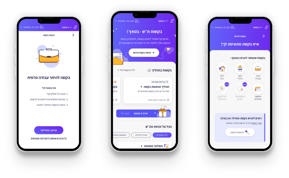
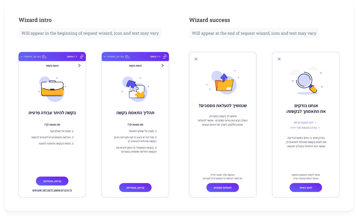
One key finding that emerged was that, on the request screen, there was confusion between submitting a request with a defined process and other requests that required review by a welfare NCO. I was tasked with finding a solution for this. I understood the importance of distinguishing between the types of actions through a visually noticeable division.
Before
After
UI Solution
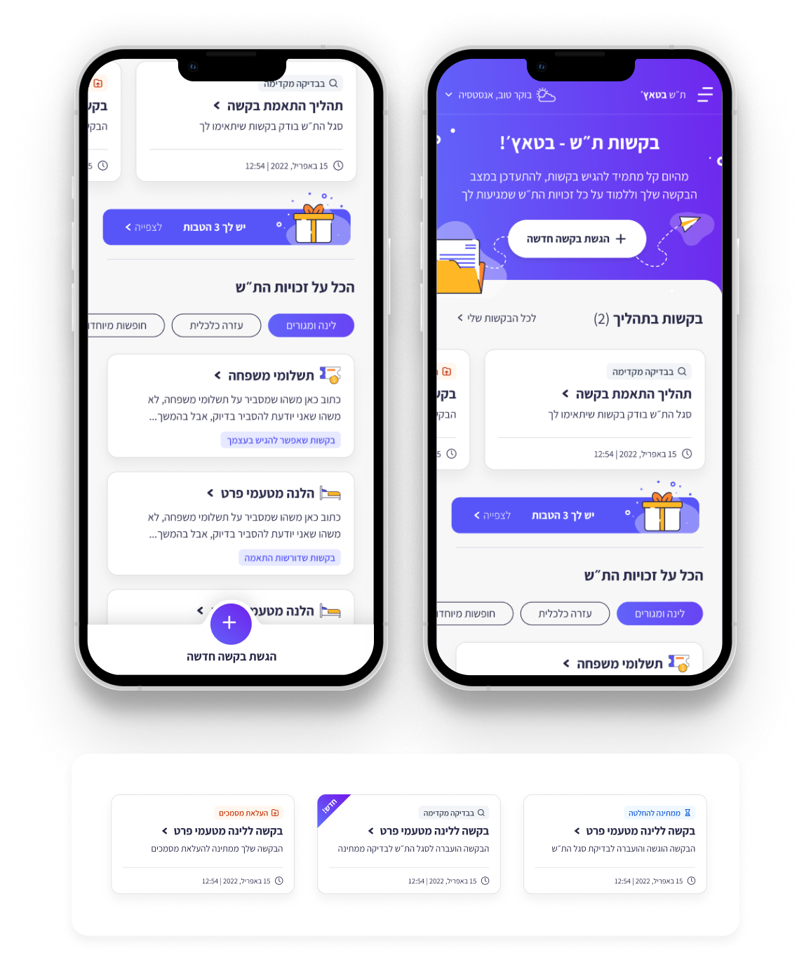
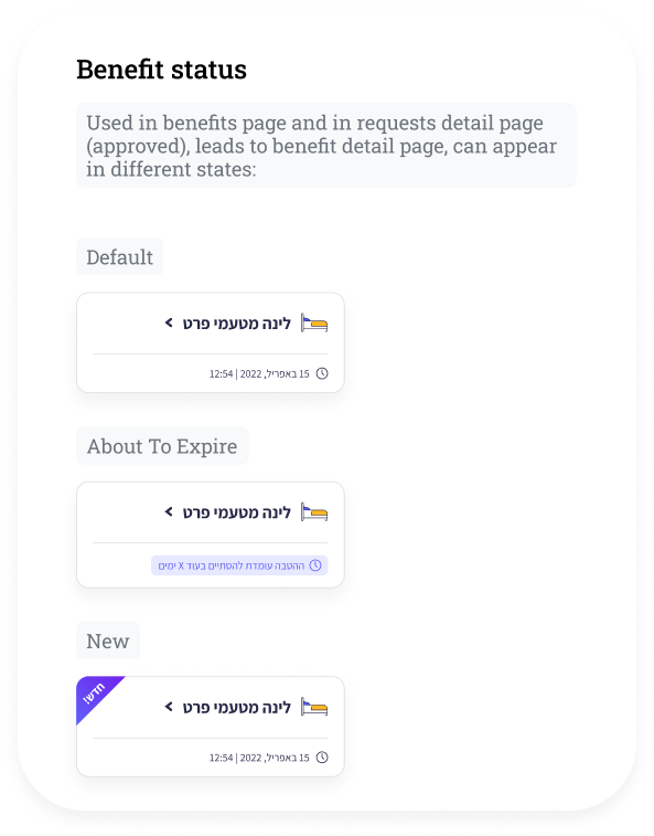
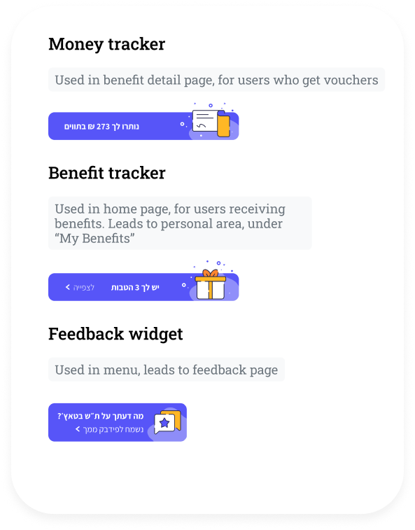
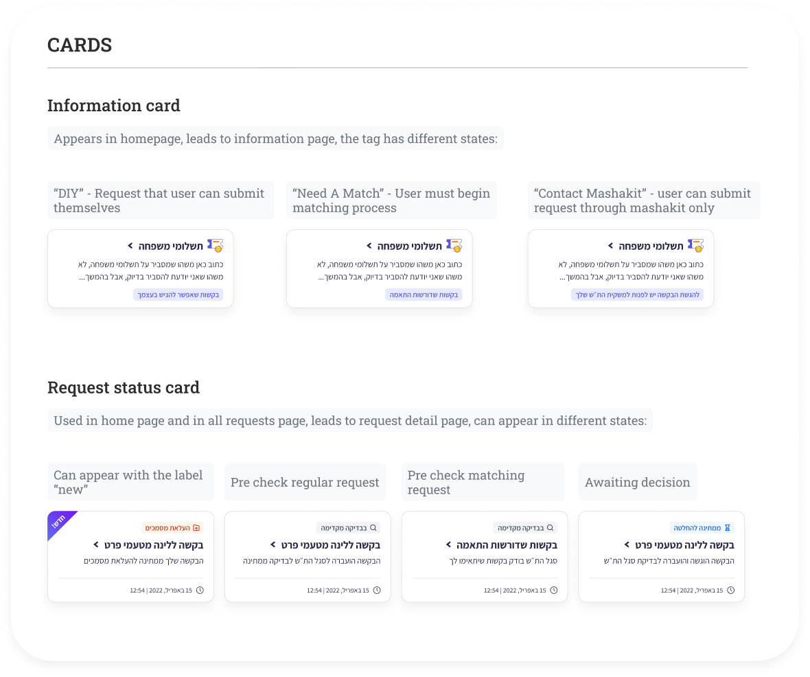
On the homepage, users can submit a new request as the main action, view all requests currently in progress, and receive textual information about welfare rights. I designed a card that supports multiple variants to allow for broader use in displaying information and supporting various situations and needs. Using variants that "fit" on the same card improves the interface's consistency, providing soldiers with a more consistent user experience and reducing their learning curve.
Key screens / Main flows to design
For more please enter from desktop
In retrospect
During my time as a product designer at Amplio, I encountered exciting challenges in the field of user experience design. I raised issues related to UX that needed to be rethought and redefined. This was a crucial point in the project, as there were areas in the system that didn’t function properly from the start and required solutions. I also needed to think through and solve edge cases for various scenarios, from empty states to UI solutions that were not yet part of the design system. One of the main aspects of the role was creating design solutions that supported both the company’s goals and the users' needs while maintaining an intuitive and personalized user experience. Close collaboration with the development, marketing, and product teams allowed me to deeply understand customer needs and business objectives, leading to effective design solutions.
Working at Amplio sharpened my skills in balancing aesthetic appeal with high functionality and provided valuable insights into large-scale digital product design processes.
I'm looking for my next experience,
please feel free to contact me
rotemegozy@gmail.com // Tel: 054.7694270
Rotem Egozy
About & Contact
Tash B’Touch
My Role
UI, UX
Year
2022
Tools
Sketch, Invision, Figma
Background
Tash B’Touch is a platform aimed at providing accessible information on soldier’s welfare benefits, known as “Tash”, in the IDF, enabling online requests for Tash benefits, and allowing soldiers to view the benefits they have received.
The website serves as a central tool for soldiers regarding their welfare processes, offering reliable and easy access to information and services, and providing them with a sense of security and support during their service.
Design goals and challenges
The main goal of the project is to create a modern, accessible, and user-friendly platform that allows soldiers to conveniently and efficiently utilize various IDF welfare benefits through mobile devices.
I joined the project after an initial design process conducted by a UX designer from the studio, where various request processes were mapped out, rights and benefits were categorized, and a framework for the platform was established.
Upon entering the project, I encountered challenges both professionally, in terms of design, and interpersonally.
These challenges included:
- Gaining the client's trust and building rapport.
- Working within a limited design timeframe before development.
- Designing the visual language in a consistent and clear manner due to the variety of requests, while conveying a sense of ease for a young user audience.
- Utilizing the color scheme and components from another IDF website that had already been developed, to save on design and development time.
Tali Cohen
"I want to know that every request I submit will be accepted and processed quickly, without having to chase anyone. Just fill out the digital form and get fast responses."
Demographic Details
Age
Marital Status
Location
19
Single
Rishon LeZion, Israel
Personal Details
Socioeconomic Status
Low
Technology Habits
Uses a smartphone daily, active on social media, familiar with mobile apps
Role in the IDF
Clerk at a rear echelon base
Service Preferences
Convenience and flexibility, proximity to home, opportunities to continue working a civilian job to financially support family.
Needs and Goals
- A basic need to submit requests for benefits easily and quickly
- Receiving information about additional requests/benefits
Challenges and Pain Points
- Lack of knowledge, doesn’t always understand the different request processes in the IDF or the rights she is entitled to
- Finds it difficult to fill out manual forms and track requests
- Skims information without reading it thoroughly
Summary
Tali Cohen is an IDF soldier seeking an efficient and convenient way to manage her requests for welfare benefits. She wants to avoid complicated bureaucracy and use technology to receive quick responses.
Research Process - User Research
Throughout the process, and because the design phase overlapped with the development timeline, we continuously conducted various usability tests with individual soldiers to learn "on the go" about their experiences and what needed to be clearer for the actual users. We realized that in order to get a clearer and broader picture, we needed to conduct more structured usability tests.
One key finding that emerged was that, on the request screen, there was confusion between submitting a request with a defined process and other requests that required review by a welfare NCO. I was tasked with finding a solution for this. I understood the importance of distinguishing between the types of actions through a visually noticeable division.
Before
After
UI Solution
On the homepage, users can submit a new request as the main action, view all requests currently in progress, and receive textual information about welfare rights. I designed a card that supports multiple variants to allow for broader use in displaying information and supporting various situations and needs. Using variants that "fit" on the same card improves the interface's consistency, providing soldiers with a more consistent user experience and reducing their learning curve.
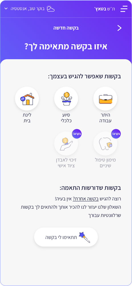
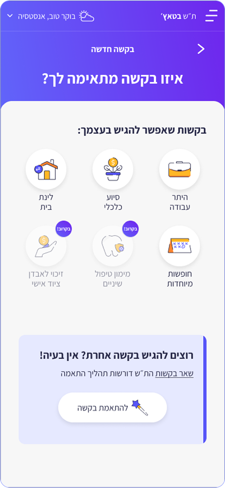
Key screens / Main flows to design
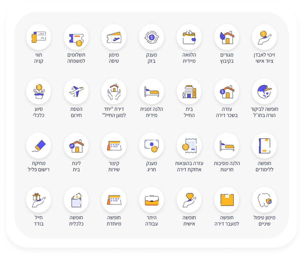
The entire welfare platform in "Tash B'Touch" consists of request processes. Each request is slightly different in terms of the questions and steps the soldier needs to answer and complete, but we frame each request in the same way.
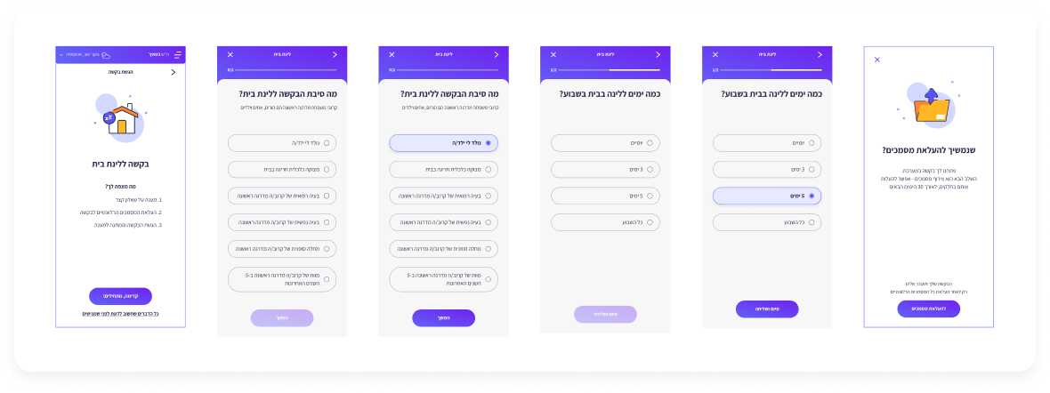
Example of request process
Fonts & Colors
I used the Assistant font, and the purple color scheme ties in with the purple cord associated with welfare NCOs. I incorporated warm color touches into the purple palette in graphic elements (icons and additional illustrations) to "warm up" and soften the overall look. The illustrative style of the icons is meant to convey openness and lightness, so I kept the lines rounded and slightly open, with extensive use of white.
#282948
Dark blue
#5755F8
Cold purple
#DDDDDD
Medium grey
#FFB725
Warm yellow
#FE852F
bright orange
In retrospect
During the development of the Tash B’Touch project, we created a platform aimed at providing information about the rights of IDF soldiers regarding welfare benefits. Our main mission was to design a modern, accessible, and user-friendly solution that enables soldiers to utilize various IDF welfare processes conveniently and efficiently.
Throughout the project, we emphasized the importance of accessibility and simplicity in the platform's design. It was essential for us to ensure that the website serves as a central and effective tool for soldiers, During the design and development process, we gathered feedback from soldiers to ensure that the interface was intuitive and comfortable, while incorporating processes that instill a sense of security and support during their service.
The result is a platform that is not only functional but also empowering, making it easier for IDF soldiers to navigate their welfare processes smoothly and providing them with the necessary tools to take advantage of their rights and benefits.
I'm looking for my next experience,
please feel free to contact me
rotemegozy@gmail.com // Tel: 054.7694270

Back to home